
As a WordPress theme designer, aesthetic matters to me. I’m always looking at my sites from a UX perspective to see how I can improve the aesthetic on both a site-wide level and on a component level.
Out of the box, the WordPress comment box is functional but rather uninspiring. In my opinion, an unappealing comment box can be an eyesore to the site.
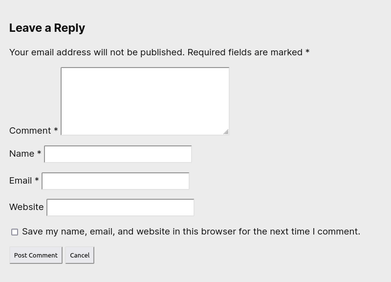
The fields are unaligned and look jumbled. This can be addressed by making labels stack on top of their respective fields. Lets fix that by applying a flex layout to those fields. Additionally, I’m setting the inputs to fill the horizontal space. To me it seems a bit strange to see the inputs not quite span the entire width on mobile screens.
.comment-form-comment,
.comment-form-author,
.comment-form-email,
.comment-form-url
{
    display: flex;
    flex-direction: column;
}

#commentform input,
#commentform textarea
{
    flex-basis: 100%;
}
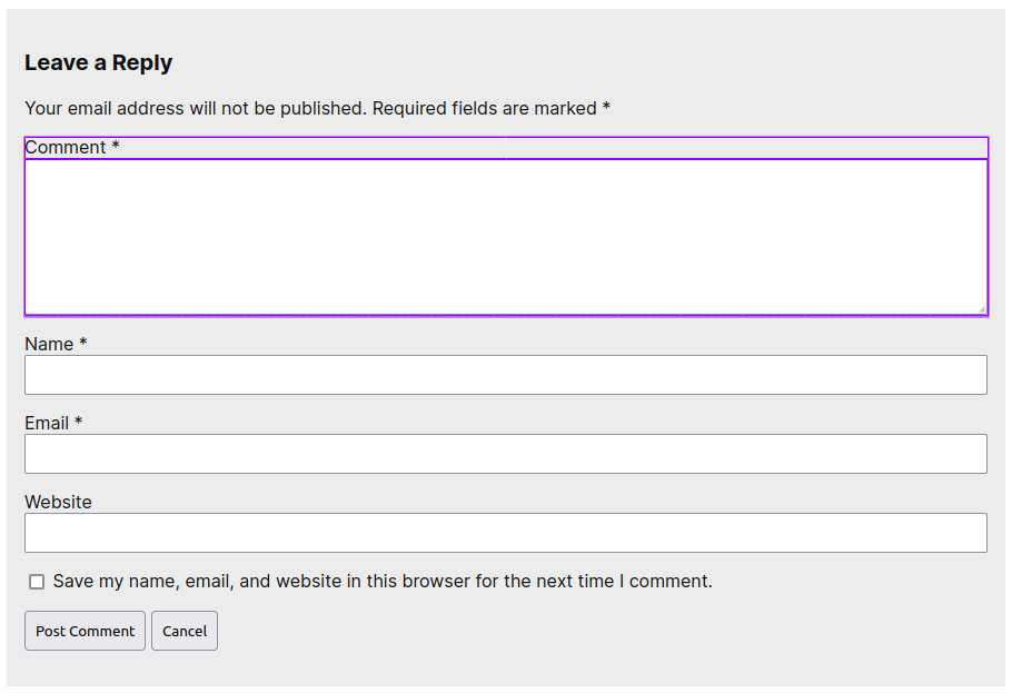
Already this is a huge improvement. It’s clean and consistent. Added bonus, it will fit right on any mobile screen. However we can do better for larger displays. Lets take advantage of more available real estate by putting the secondary fields next to the comment field.
To accomplish this layout, I’m applying a grid layout on the fields, nested in a media query for viewport width.
@media screen and (min-width: 960px)
{
	#commentform
	{
		display: grid;
		grid-template-columns: 1fr 1fr;
		grid-column-gap: 1em;
	}

	.comment-notes
	{
		grid-column: 1/-1;
	}

	.comment-form-comment
	{
		grid-row: 2/6;
	}

	.form-submit
	{
		grid-column: 1/-1;
	}
}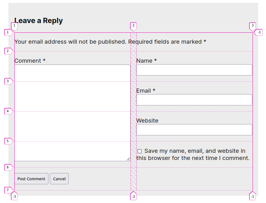
Ah, chef’s kiss! Without taking up any additional vertical space, the comment box now sports an elegant and spacious look. If you like it, please let me know in the comment section below this article.