
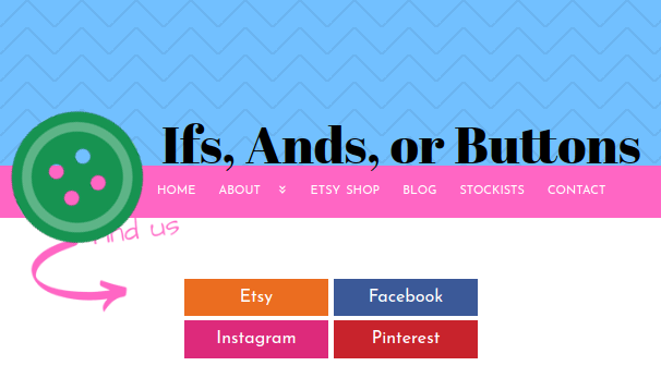
The traditional long horizontal menu looks great on big screen desktops and I’m a fan of it. It does not look so great on small screen mobile devices for lack-of-space-related reasons.
What’s trendy with menus and small screens is displaying a coloured stripe with a hamburger, the iconic 3 horizontal lines. Tapping on the hamburger expands the menu into a full-screen vertically stacked display.
I’ve mentioned in my other blogs that I look for easy solutions to my problems. Mean Menu Refueled, a WordPress plugin, automatically transforms my navigation menu into a mobile responsive menu on small screens. Even better, it does all of that for me with zero coding and lots of visual control.
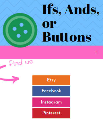
Mobile menu collapsed 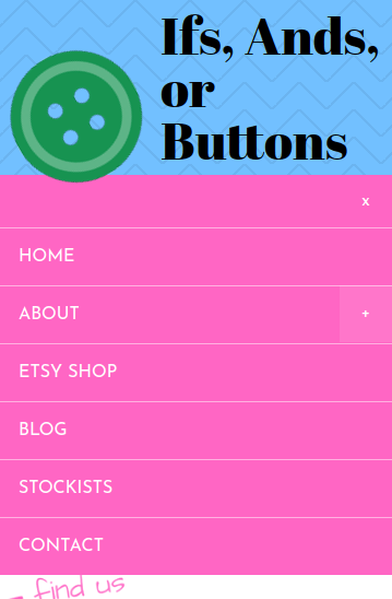
Mobile menu expanded
1. Install the plugin
Download and install Mean Menu Refueled from the WordPress plugin repo.
2. Configure to preference
Out of the box, the plugin does a pretty good job of setting itself up. You shouldn’t have much trouble with a straightforward WordPress theme. I’m going to cover a few of the options that I felt were necessary but you should read the full plugin documentation.
- Menu target This is how Mean Menu finds the normal menu, with a CSS selector. This actually needs to be a selector to the menu’s container so the name could perhaps be reworded. If you’re unsure, try leaving it blank – this lets Mean Menu try to find your menu by itself.
- Menu anchor This is how Mean Menu knows where to place the mobile menu, with a CSS selector to a container element. By default the plugin uses body, making the menu the very first thing on the site. I find it a bit strange that the mobile menu isn’t placed in the same spot as the normal menu but perhaps this will be an improvement for future versions.
- Bar colour & Menu colour This lets you control the look and feel by setting the background colour of the menu and collapsed bar. You will want to make this the same colour as the background of your regular menu.
- Responsive threshold This is the minimum activation width of the browser window in pixels. When the browser width is this width or smaller, the mobile menu becomes active. The default is 640 – experiment to see what works best for your menu.
And that’s it! A very simple plugin for making your site more mobile-friendly.
Ifs, Ands, or Buttons is an Ottawa based small business that creates buttons, magnets, and more!